Tuesday, May 19, 2009

Dahlia Fold Flower


I ran across a flower fold tutorial posted by Kitty Blevins and had to try this intersting design. As I experimented with the flower I found several posts on the web with variations of the technique. I'll share here what worked best for me.

The flower is usually made with a simple set of circles. I used 1.5" circles that I punched with a Creative Memories punch. I did find examples of this folded flower that used scalloped edges, and that produces a very different look which you might consider trying.

The other thing I liked about Kitty's version of the Dahlia flower was that she distressed all the circle edges. This gave the flower a special look that really made the difference for me. I have made several different versions of the flower now, and each takes on a different look depending on the paper choice and the distress ink.
.

For my example here I am starting out with a 2 sided paper that had a big color difference. One side very dark and one side a very light color. I did this on purpose so that it would be easier to see the folds. However, the distressing really doesn't show up on an extremely dark color. So, I have also displayed a finished version of the flower that is a better example of the distressed look. The flower itself can be made with a varying number of petals. I tried versions with 10, 9 and 8 petals. I liked 8 petals the best because the finished flower had a more scalloped look. The 10 petal flower had a finished look that was more circular. I will demonstrate an 8 petal flower here. Aside from the 8 circles for petals, you need one circle to use as a base to attach the petals. I found that a circle 2" or slightly larger provided an easy to use base.

To make a petal, first fold a circle in half. I tried not to put a hard crease in the petal because you are only going to use this fold as a guideline, so we don't necessarily want this crease to show on the finished flower.

Next you will fold in a narrow portion of the petal edge using the center fold as your staring point. You can change drastically the look of the flower by varying how large you make this folded edge.

Repeat this fold on the other side of the petal. You can see that these two folded edges only extend about halfway up the circle.

Now turn your petal over and fold the same petal edges into the center. You should still be able to see your faint center crease to guide the folding. The finished petal will look like this. Complete these same folds for the other 7 circles. You may have noticed that I did not distress my circle yet. I actually wait until all my folding is done and go back and distress the shapes. I do this because you need to distress both the front and back side of the circle, but only small sections. I found if I distress the petal after I folded it, I could tell just were the distressing needed to be placed.

When your distressing is complete you can begin attaching the petals to your base. I draw two lines on my circle base so I can easily identify the center. Then I just hold my petal by the top most folded edges and place the petal on the base keeping the petal point very close to the center of the base circle.

I continue placing petals around the circle. I make sure the petals touch each other, or have a very small overlap. I have used both glue dots and repositionable adhesive (Hermafix) to attach the petals. The nice thing about the repositionalbe adhesive is that I can adjust the petals a bit to get the best look.

Here is a completed flower. With a paper choice that has a medium to light color, the distressing of the flower edges really show up. Hope you enjoyed this. Have fun!

Read more...

Sunday, May 10, 2009

Distressing & my favorite border punch!


The more distressing I do on layouts the more I love it. I have been expanding the colors of ink I use and recently add the Weathered Wood to my growing collection. In my "Partners for Life" layout I used 3 different colors of distress ink to achieve the look I was after.
The ink colors are Antique Linen, Walnut Stain and Weathered Wood. I use distress inks often alone, but sometimes in combination. Most of the time I use a simple sponge dauber tool to apply the distress ink. On this layout I used the Antique Linen on the very outside edge of my background paper. I then used the Weathered Wood distress ink on the edge of my blue paper on top of the punched border to make it stand out more against the background paper. Last I wanted a mat for the photo that had an uneven edge, but I didn't want to tear it because I wanted a jagged edge that was small. So I hunted around and dug out my old Fiskars deckle edge sizzors which I have had for years. I then experimented with a sample piece of paper before cutting and inking my photo mat. After cutting the deckle edge, I sanded the edge so that I would have a completely white edge on the paper to work with. The close up photo left is how my paper looked before I began inking. With the photo mat I wanted some depth to the look, so first I inked the edge with Antique Linen. I brought the color approximately 1/2 inch into the paper. I left that dry just a bit and then went back and used the Walnut Stain distress ink to add a darker color to the outside edge. On the corners of my mat I pulled the dark Walnet stain a little farther in. The photo mat was about 5/8 of an inch wide so I had some room to vary the distressing. Last I distressed the striped piece of paper with just the Walnut Stain ink adding color only the the very edge to give it depth. I did the same process to my title on the word "Life". For the title this better defined the letters and let them stand out better from the background.


Because I love border punches and the Martha Stweard Doily punch is one of my favorites I wanted to share how I did the corners. The steps I am going to share are what I do with any border punch I buy, so you can apply these steps to your favorite punch.


When I get any new punch and experiment with it for a while I will decide what "look" I prefer for a corner. With the Doily punch I liked how the corner turned out when I let two scallops meet at the corner which gave the corner a more rounded look. Once I figure out what I am after, I just need to give myself two things, first a consistent way of lining up the two edges of paper and second an easy way to measure and trim my paper so I have a result I can reliably repeat. I always start figuring out what I need to do with plain old computer scrap paper. So I am going to show you an example using just that. I have here two pieces of computer paper. On one piece I punched a one side. the other piece I took my punch and cut a single image a short distance from a corner. I did this on purpose because I want to know exactly how far in from the edge of the paper the punch creates its design. I decide how I want to line up the corner design. Here you see red circles that I have drawn around a hole that sits in the design at the lowest point in the scallop. I am going to use this part of the punch design to line up my corner. I take the piece of paper with the single punched design and set it on top of the piece of paper with the punched edge. I make my second piece of paper turn the corner and I line up those two red dots. In the photo at left they are sitting on top of each other. Next I take a pen and draw a line on my bottom piece of paper exactly where the paper edge ends on the top piece of paper. It may be a little had to see in this photo but when I remove the top piece of paper you'll see exactly what I did.

The line I drew is clearly visible here. I will trim my paper exactly where I put this line so that when I put the paper in my punch and turn the corner I can line up the small punched hole in the design with the same hole in the punch itself for a clean corner. To punch the corner you will need to turn the punch upside down when holding it in your hand. I make a note, or keep this scrap piece of paper so I can trim each of my four corners to the exact same distance.

Read more...

Saturday, April 25, 2009

Punching great corners!


I was asked recently how I got such clean corners with my Fiskars Threading Water paper border punch. It's really not difficult at all once you take a few steps. First you'll need to punch one edge of your paper with the border punch. Then we'll can start working on an example of a corner. The key to a great corner is just having the ability to line up the curve on your last scallop with the curve of the first scallop on the next edge.
Since the border punch has a specific width or distance from the edge of the paper where the cut occurs, you just need a reference point to create this exact distance. I have found from experience that if I trim off the edge of my paper to the exact point where one of the small holes in the punch design sits, then I can easily line up the punch when I turn the corner. I have an example in the picture on the left. The dark line represents the point where I will trim the edge of the paper. See how the line I have drawn just touches the small hole in the last scallop design.


Here is another picture where I have trimmed the paper. The paper I am using here in this example is two sided and the green side is the topside of the paper, the backside is a red and orange print. To turn our corner we'll need to work holding the punch in our hands upside down so we can see how the paper is lining up with our desired design.


Although it is a little hard to see in this picture, when I slide the new edge to be punched into the border punch I can use the small holes in the design to be sure that my corner is lined up. In the picture the first hole on the left lines up perfectly with the little hole that was created by the last scallop on the previous edge that I punched. All you need to do is punch the corner while holding the paper and punch upside down, then you can turn the punch back over and work as you normally would lining up the punched design with the design painted on the punch guide. Hope this helps those of you who are enjoying this Fiskars border paper punch!

Read more...

Masking with Drafting Tape


When I created this Skateboard layout for a friend I wanted to add a little bling to this "Boys" page. So I decided to create some distressed lines up to a series of stars reminiscent of search lights. To create the distressed lines I used drafters tape. It looks a lot like ordinary masking tape, but the sticky formula is different. This tape is designed to work well with paper and can be removed and repositioned without harming the paper. I learned about the useful qualities of drafters tape from my watercolor painting experience.

In this layout I wanted a nice clean edge for one side of each line, so I put a piece of drafters tape down and distressed the page starting from my tape and moving away. I repositioned the tape for each line. When my distressing was complete I took Stickles (here's the bling) and applied it near the straight edge of each line. Then I used an old watercolor paint brush to spread the Stickles over each line giving them a nice sparkle.

Read more...

Saturday, March 14, 2009

g.c.d Studios has a NEW blog-plus a give away!

Hey I wanted to share that g.c.d Studios has moved their blog and to kick things off at their new location they are having a give away of a New paper pack--Chic Bebe! To participate just vist their blog and link it to your blog. They will draw a winner on Monday, 3/16/09. They have some very pretty papers, so check it out!

Read more...

Saturday, March 7, 2009

Perfect Corners Everytime!

Sometimes my perfectionist nature creeps into scrapbooking and I find myself wanting to "fix" something. Actually, I probably fight with this tendency more than I'd like to admit, I am sure this has influenced my scrapbook style. Well I love all the decorative punches on the market; I own quite a few. The last couple I purchased were from Martha Stewart. I used her Doily border punch in my "LOVE" layout below.


I really like to use border punches on the outside of a square, but I always want my corners to meet perfectly! With the two Martha Stewart punches I bought, I just couldn't get a really clean look even with practice. So I decided on an alternative which is what I want to share here. In my "LOVE" layout I actually used the Doily border punch on card stock strips, created mitered corners, and affixed these behind by patterned paper square. I want to show you how I did the miter with the paper strips.
To explain how I did this I am going to have to introduce one of my favorite tools. Yes, this is a quilter's ruler. I use it all the time. I am always looking for an easy way to accomplish a task and with this tool I can attach a pic to card stock and cut a clean 1/8" border around the pic without measuring anything. I just use the quilting lines, all set 1/8 or 1/4 of an inch apart.

The other cool feature on this ruler is the angles. The ruler has two lines with mark a 45 degree angle which is what we need to create a mitered corner!


To create a perfect corner with a perfect 90 degree angle we start with two strips of paper punched with our border punch. We then need to decide on a spot in the design for the corner to match up. Once we have decided on a match up point we cut our strip at a 45 degree angle making sure we end our cut at our match up point. the quilter's ruler makes this easy because all we do is line up the straight edge of our punched strip with the 45 degree angle painted on the ruler and cut. Here is a closer look at those angles painted on the ruler.

When we cut our two strips, each strip with have a 45 degree angle cut, and the cuts will mirror each other. When the corners are matched up, you will have something like this. In this picture I have matched up the corners of the Martha Stewart Arch Lattice border punch. Both of these punches give such pretty results!

Read more...
Our pup Truman is on the mend!


The last 6 weeks have been full of ups and downs as we have tried to keep our youngest lab out of trouble as he heals following his knee surgery. The first month had me worried as he just wasn't following the norm as far as his ability to use the injured leg and walking goes. More x-rays revealed that the healing was going fine, Truman just needed to use his leg to build muscle and confidence. The last two weeks we have really seen improvement and he has begun to show signs of his old self--such as in this pic. Truman is actually teasing our other lab Gracie with this toy. He wants her to chase him. This kind of play is still off limits, which our sweet Gracie does not quite understand.
I have hidden all the toys but brought this chew toy out to give Truman something to keep him busy. It is such a relief to have progress. Another month or so and he should be good as new!

Maybe now I can regain a little of my time for scrapbooking--and take a few more pics of our dogs for layouts. I think Truman is probably the most photogenic dog we have had, and a ham to beat!

Read more...

Saturday, February 21, 2009

Great changes to the Silhouette software!

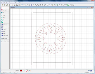
I bought a Silhouette digital craft cutter in November 2008 and have really had a lot of fun with it. Of course, Quickutz just came out with an updated version, but the great news is the new software can be used by my existing machine. Wow was I excited when I upgraded the software and started using the meld function. Here is my first LO where I created a whole new design, a scalloped frame, by starting with just a piece of an existing digital image (Quickutz Damask_8052).
I used just the top most flourish of the Damask image, deleting all the other pieces of the design.

Here is my single flourish from the Damask image. I have drawn a 6.5" circle on my screen and positioned the center of the circle on the intersection of a horizontal and vertical grid line. I then re sized the flourish to 2" high and put in on a vertical grid line with the tip of the flourish touching the circle.


I then copied and pasted the original flourish and positioned it on either horizontal or vertical grid lines.


Each time I added a flourish I made sure the tip of the flourish was touching the outer circle, this ensured that my design would be a perfect circle shape.


After I had placed the first four flourish images, I then continued to copy and paste 4 more shapes. This time I had no grid lines to help with placement, but the first four shapes could be used for evaluating spacing.

With the placement of these flourishes you still have the outer circle to guide the placement of the tip of the flourish.


With all the flourishes in place its time to create our welded image. Select the circle and now re size it smaller. You'll want to make the circle small enough to allow the 3 leaf like shapes to extend outside the circle. Once your circle is re sized, select all the shapes at once (all flourishes and the circle). If you have selected correctly, all of the shapes should appear blue.


Click the "weld" button, it will be the second to the last button on the right. All of the inner lines should disappear and you will have the outside share of your frame. It it doesn't look right you can always undo the weld action and reposition your circle for a better shape.

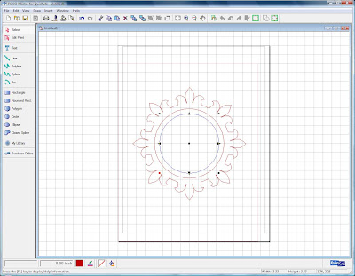
We still need some inner circles to finish the frame. Make sure you don't move the shape because we need to line up our inner circles on the grid.


I added two additional circles to my frame because I wanted a circle inside the fancy edge to set against my picture. I made sue that each new circle I added had the center of the circle placed on the same intersection of the grid that my original circle used. This allowed me to have a perfect center for placement. I then selected all the pieces of the image, both circles and the outer frame and "grouped" them together. Once grouped I could move the image around or re size it and retain the proportioned shape.

Read more...

Saturday, January 24, 2009

Embellishments -- the fun little details!


I have fun doing this layout for my friend of her beautiful granddaughter. I thought this was the sweetest picture! I was trying out some techniques that I had read about on some other great blogs, my thanks to Gabrielle at "Such a Pretty Mess" for these ideas. I wanted to share my experiences with this creative adventure.

One of the things I tried with this layout was to add sparkle to the flowers. I know there are a number of products you can use to do this, but I had "Diamond Stickles" in my supplies on hand so I added this to the ends of the petal of my mid sized flower. After stacking three blooms together, the Stickles gave the bloom a nice shine.

I also experimented with adding a butterfly to my layout that was taken from a photograph. I had looked into purchasing inkjet transparencies as that is what has worked so well for others. However, at my local Office Depot they only sold these in boxes of 45, and that made the cost a bit pricey. Browsing the store I did find some vellum that was for inkjet printers. I like to use vellum for a number of things so I thought a package of this wouldn't go to waste even it I didn't get the effect I wanted. I looked through my photos and clip art but didn't have just what I was looking for so I did a search on the internet and was amazed at the wealth of butterfly photos and clip art that is available for free. I opened a text document and just started saving pictures I thought would be useful. When I had a page full I decided to give the printing a try. My HP printer was a little fussy with the vellum paper. I had to change the settings so that the printer would not try to "automatically" determine the paper size and manually set it to plain paper before it would feed the vellum without jamming. Once the setting were modified, I loaded just one sheet of vellum and it printed fine. I then carefully cut out the butterfly I wanted for my layout and decided to add it to the center of a flower.


I added Stickles to the petals of this flower and used some glue dots to adhere the flower petals and the butterfly. The vellum is light weight, so not as sturdy as a transparency, but the effect was still pleasing. If you want butterflies on a budget, this is an option.

Read more...
Thursday, January 15, 2009

Punched Paper Elements can add Impact


I created this layout to participate in a sketch challenge on the My Creative Scrapbook website. I wanted to add something different to the layout and decided to create the circle frame in this layout with punched paper swirls. I liked the effect when the layout was completed, the time consuming part was getting all of these small pieces of paper to line up in a perfect circle. I want to share her how I managed to achieve the circle without drawing any guidelines on my background paper.

I used a paper punch by "Punch Bunch", it is rather small but a pleasing shape.
I punched 10 or so shapes and laid them on a curve. I then estimated how many additional punched shapes I would need to complete a large circle. I went ahead and punched all the shapes I thought I would use. Since I was working from a sketch I tried to keep in mind that I should not stray too far from the original idea. When I decided on the exact size of the circle I went to my stash of "left over" paper items and checked to see if I had cut out a circle in the past that went unused in a project. Sure enough, I found a circle that was just the size I needed.

I placed the paper circle on my background paper and held it in place with just ordinary "Post it Notes." They are the yellow papers in the picture left. Since these sticky notes are made to lift off any paper, they can easily be removed witout harming the backgroud paper. I then started placing my paper shapes around the paper circle making sure that the curved edge of the paper swirl just touched the paper ring. Once I have all the paper swirls placed on the circle, I carefully glued each swirl down individually. It took some time to do this, but I felt the end result was worth the effort.

Here is a little better picture of how the shapes were placed against the circle.

I think this technique could be used successfully for many different paper punch shapes. I have already been thinking about some other shapes I might try.

Read more...

Thursday, January 1, 2009

Stamped Embellishments


One of the key embellishments on my "You & Me" layout was the stamped image of the heart. It was stamped on plain white paper and cut out. The heart supported the theme and was a beautiful addition to the page. I love using stamps to create embellishments because there is versatility here, since any stamped image can look very different depending on the color you make it. The red image here was perfect for the predominately black and white page.


With my "Princess Gracie" layout I also added stamped embellishments that I had cut out. Here, however, I stamped the images on patterned paper with black ink. So the paper dictated the look of the embellishment, rather than the color of the ink. Both methods yield great results.

Read more...

About This Blog

  © Blogger templates Newspaper III by Ourblogtemplates.com 2008

Back to TOP